Lorem ipsum dolor sit amet, consectetur adipiscing elit, sed do eiusmod tempor incididunt ut labore et dolore magna aliqua. Ut enim ad minim veniam, quis nostrud exercitation ullamco laboris nisi ut aliquip ex ea commodo consequat. Duis aute irure dolor in reprehenderit in voluptate velit esse cillum dolore eu fugiat nulla pariatur.

Basic Layouts consist of two columns. These can be filled with any sub component content such as headings, paragraphs, buttons and images. All text should be wrapped in a component called container wrapper.
Buttons can be placed inside a button wrapper inside the container wrapper allowing them to flow in a correct path horizontally.
this example has the text and wrapper in column one and the image in column two.
You can adjust some classes to adjust the content on the left hand side. Variants are set layouts and a good starting point for adjustments. Most components have a few variants to play with.
Classes allow you to add styles to the components, but only in specific ways, such as padding or reordering. While you can use the preset, properties offer more control in certain ways. Refer to the style guide page for examples of styles to use.
*some styles only apply to specific objects and may not work as expected on all components. Delete unused styles in the property to prevent issues if the result is not what you're looking for.
This page is built using a wide varity of components. Components can be found on the left had side in the component tab. You can order the components in any available page slot on the left navigation viewer. Always use the order to start like this Section Component > Layout. Multiple layouts can be used in a section and will stack on top of each other. Dragging the layouts on the left panel will reorder which one comes first.
Basic Layouts consist of two columns. These can be filled with any sub component content such as headings, paragraphs, buttons and images. All text should be wrapped in a component called container wrapper.
Buttons can be placed inside a button wrapper inside the container wrapper allowing them to flow in a correct path horizontally.
this example has the text and wrapper in column one and the image in column two.
You can adjust some classes to adjust the content on the left hand side. Variants are set layouts and a good starting point for adjustments. Most components have a few variants to play with.
Classes allow you to add styles to the components, but only in specific ways, such as padding or reordering. While you can use the preset, properties offer more control in certain ways. Refer to the style guide page for examples of styles to use.
*some styles only apply to specific objects and may not work as expected on all components. Delete unused styles in the property to prevent issues if the result is not what you're looking for.


Itineraries
Unsure where to start? Like the design of a module on a different page, but don't want to start from the beginning to get the look? You can copy any component on any page using your standard Command + C (Mac) or control + C (windows) and paste it in any page slot (some page slots may cause restraint issues, but you can reorder or delete the )
Paragraph component. Lorem ipsum dolor sit amet, consectetur adipiscing elit, sed do eiusmod tempor incididunt ut labore et dolore magna aliqua. Ut enim ad minim veniam, quis nostrud exercitation ullamco laboris nisi ut aliquip ex ea commodo consequat. Duis aute irure dolor in reprehenderit in voluptate velit esse cillum dolore eu fugiat nulla pariatur.
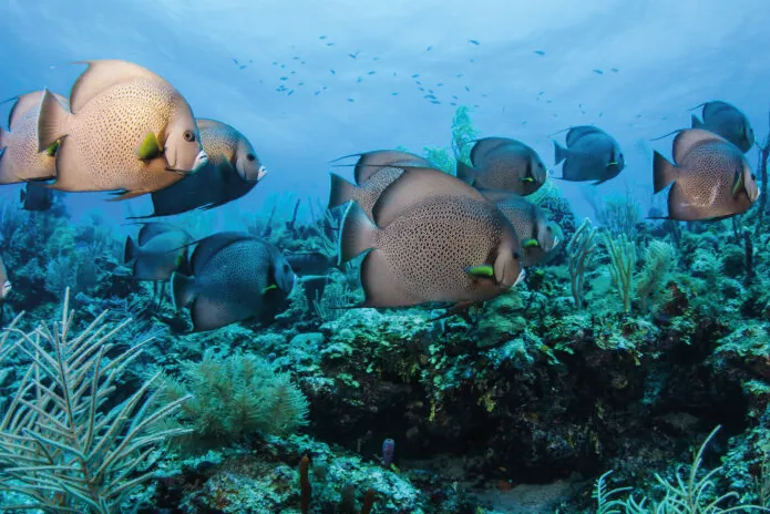
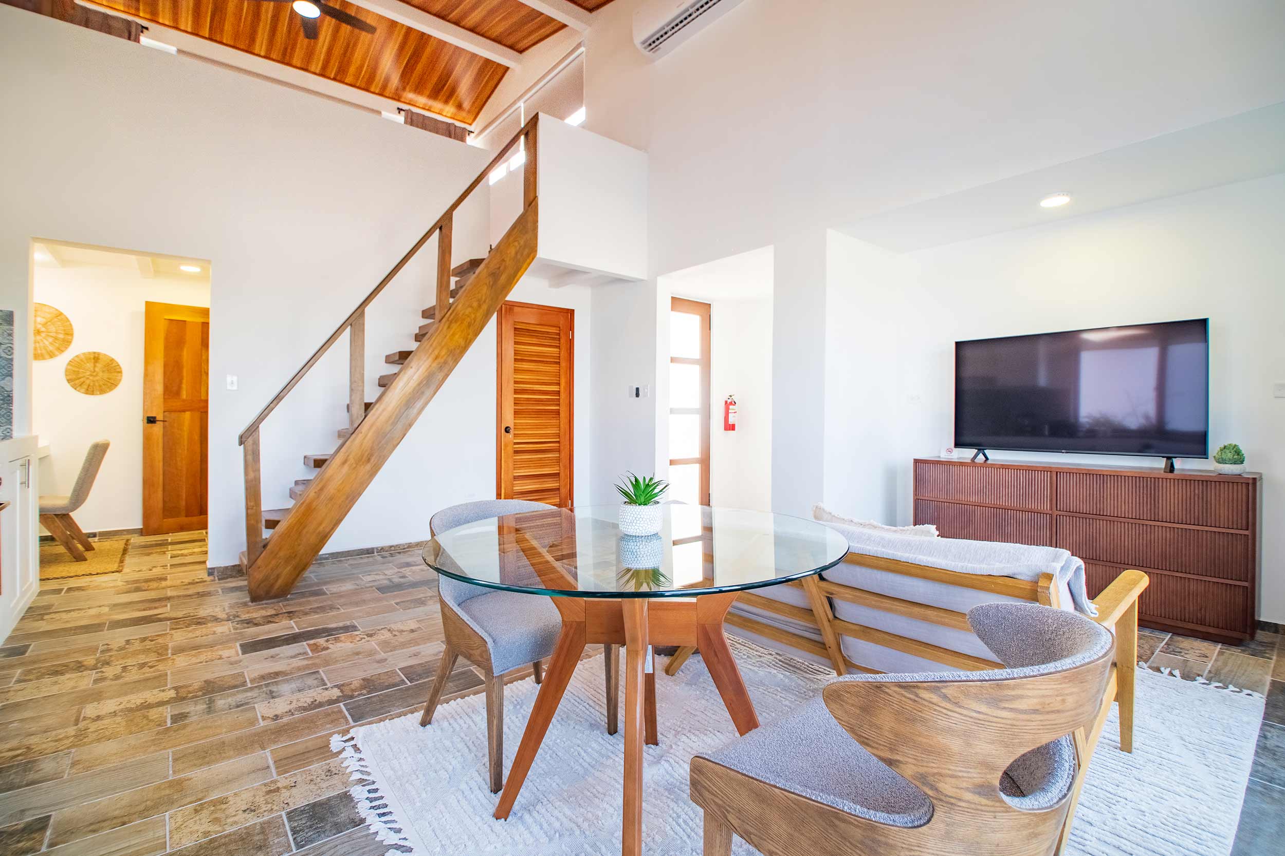
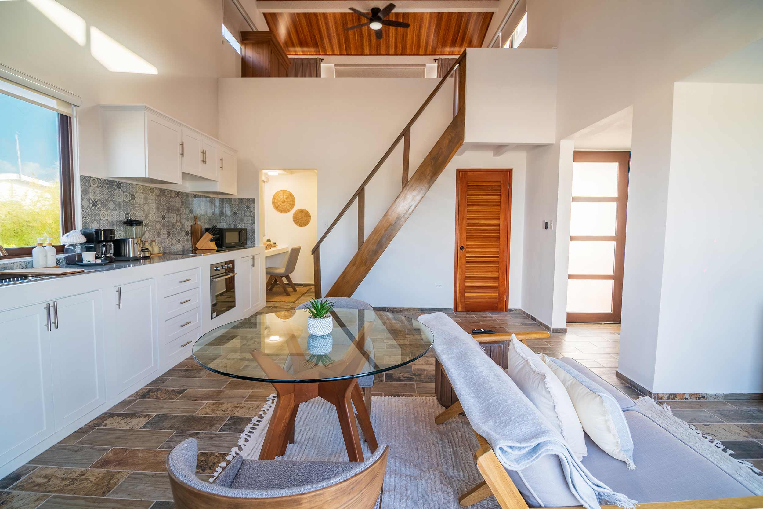
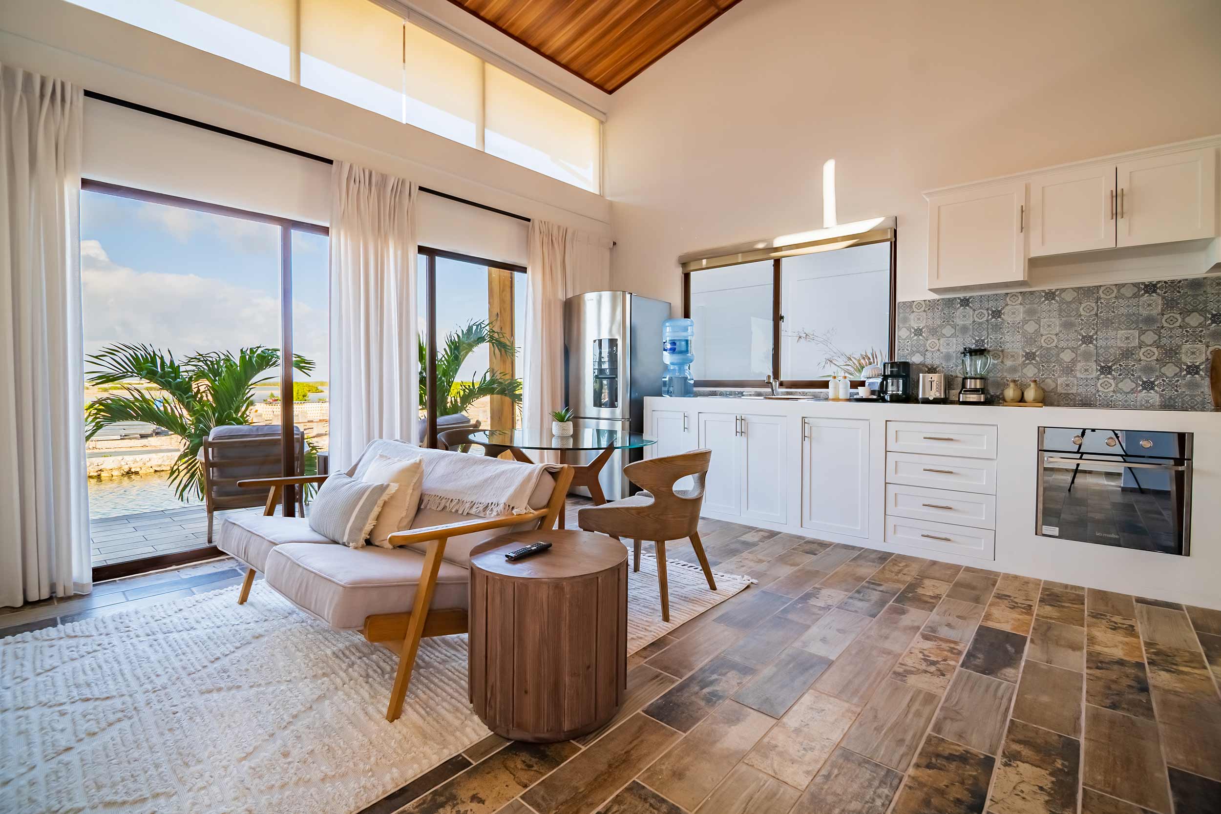
The galleries on this site are keyed to the gallery collection. You can add images to the general galleries collection and either use existing or create new filters in the gallery site filters collection. Each gallery can change by switching the associated filter in the properties panel on the right. Images can have more than on filter applied to allow it to show up in different galleries.
*removing all filters will cause the image to not show up in any gallery.

Paragraph component. Lorem ipsum dolor sit amet, consectetur adipiscing elit, sed do eiusmod tempor incididunt ut labore et dolore magna aliqua. Ut enim ad minim veniam, quis nostrud exercitation ullamco laboris nisi ut aliquip ex ea commodo consequat. Duis aute irure dolor in reprehenderit in voluptate velit esse cillum dolore eu fugiat nulla pariatur.
Paragraph component. Lorem ipsum dolor sit amet, consectetur adipiscing elit, sed do eiusmod tempor incididunt ut labore et dolore magna aliqua. Ut enim ad minim veniam, quis nostrud exercitation ullamco laboris nisi ut aliquip ex ea commodo consequat. Duis aute irure dolor in reprehenderit in voluptate velit esse cillum dolore eu fugiat nulla pariatur.
Paragraph component. Lorem ipsum dolor sit amet, consectetur adipiscing elit, sed do eiusmod tempor incididunt ut labore et dolore magna aliqua. Ut enim ad minim veniam, quis nostrud exercitation ullamco laboris nisi ut aliquip ex ea commodo consequat. Duis aute irure dolor in reprehenderit in voluptate velit esse cillum dolore eu fugiat nulla pariatur.
A side scrolling gallery modal tied to the specials collection. will automatically updated. Shows specials with the order numbers 1 thru 5.